dsh-mobile-comfort
Run the following command in DeepSeek Harness:
dsh plugin install oksure/dsh-mobile-comfort
Paste the following prompt into your AI chat to install this plugin:
Run dsh plugin install oksure/dsh-mobile-comfort in DeepSeek Harness; the source is hosted at https://github.com/oksure/dsh-mobile-comfort . Restart dsh web after installation to load the plugin.
About this plugin
Open the DeepSeek Harness web UI on a phone and a cluster of touch-specific annoyances shows up: tap a sidebar control and a tooltip lingers like a ghost because no mouseleave ever fires on touch browsers; try to tap quickly and iOS Safari zooms the page instead of clicking; on narrow screens the 280 px sidebar stays as a rigid grid column, squeezing the composer into a sliver. The root cause is that the client UI shipped without any touch-device awareness—no touch-action policy, and the tooltip component only models desktop mouse event lifecycles.
This plugin injects a responsive stylesheet and a mobile drawer controller as an out-of-tree bundle, fixing six concrete problems: it hides tooltip elements under hover:none and pointer:coarse media conditions, sets touch-action:manipulation on interactive elements to remove double-tap-zoom ambiguity, expands touch targets to 44 px, converts the narrow-screen sidebar into an overlay drawer that auto-closes after a session is selected, suppresses touch-only hover misfires on session cards, and expands collapsed session groups on sidebar entry. Every rule keys off input modality or pointer class, so desktop mouse behavior remains completely untouched.
The target audience is straightforward: if you use Harness in iOS Safari or an Android browser and want a comfortable touch experience, this is the fix. After installing and restarting your profile, tap the sidebar toggle on a phone—if no tooltip lingers, you are good to go.
Use Cases
- Using Harness daily in iPhone Safari without ghost tooltips
- Interacting with the sidebar and composer on a tablet without accidental zoom
- Expanding the session list as a drawer on narrow screens instead of squeezing the composer
Best For
- Users who prefer mobile browsers over desktop for daily Harness use
- Developers who care about real touch experience on handheld devices
- Remote workers using Harness in iOS or Android browsers
Related Plugins
A service-oriented sidebar framework for DSH, offering a full workbench with file explorer, embedded browser, real terminal, Git panel, and extensible plugin services.
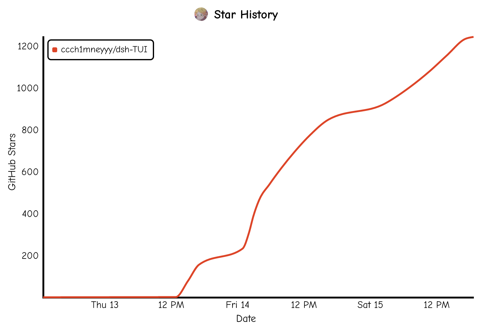
A beautiful, practical Claude Code-style TUI plugin with pixel whale top bar, flowing glow title, real-time status line, streaming thought expansion, time rewind, context progress bar and TPS gauge — zero core changes.
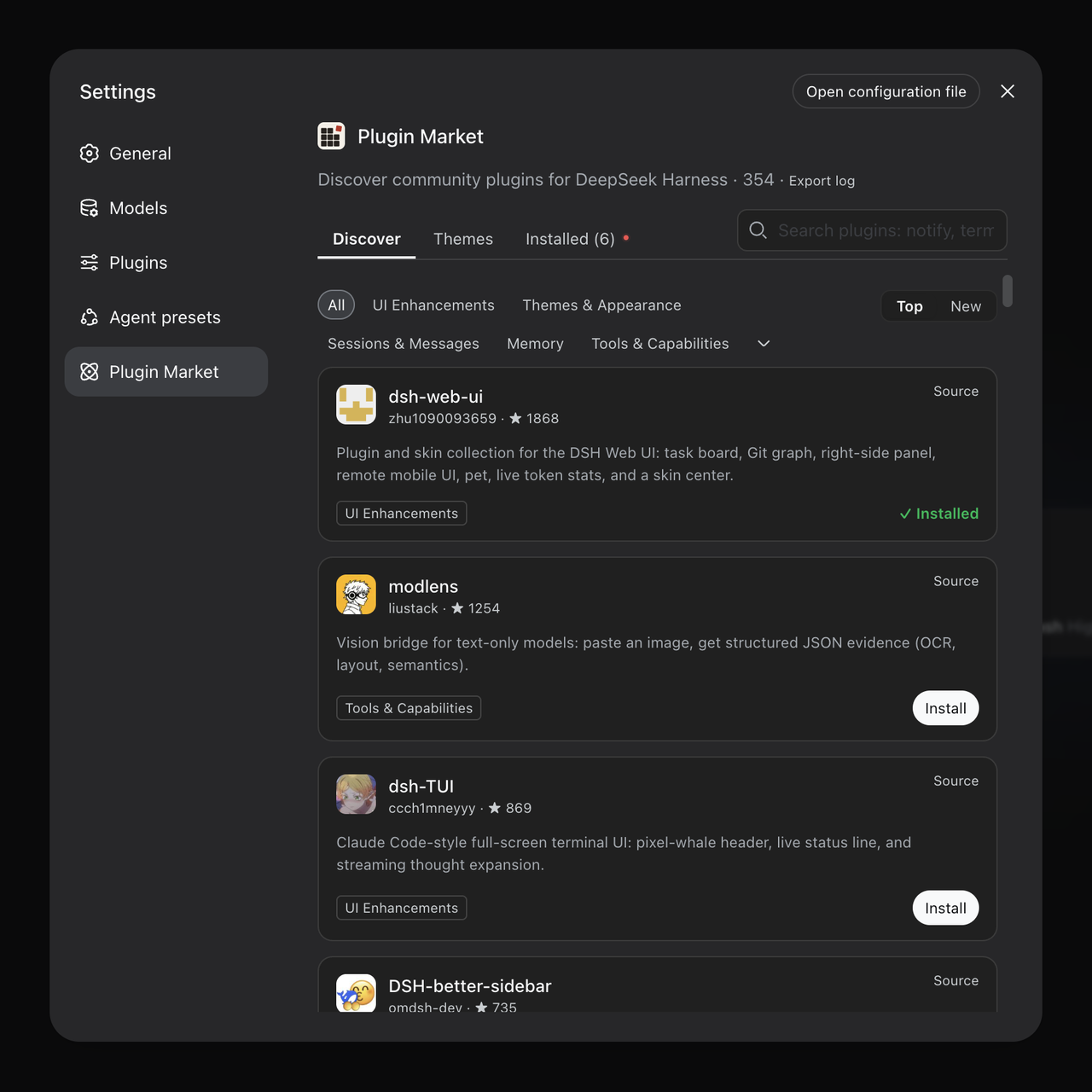
The plugin market for DeepSeek Harness: browse/search/one-click install community plugins and themes, with updates, backup/restore, hot disable, diagnostics, and AI fix.

A persistent whale widget on the DSH web UI that shows DeepSeek balance, today's usage, and per-turn cost, with drag-and-snap and sound effects.