dsh-maestro-mobile
Run the following command in DeepSeek Harness:
dsh plugin install ddtcorex/dsh-maestro-mobile
Paste the following prompt into your AI chat to install this plugin:
Run dsh plugin install ddtcorex/dsh-maestro-mobile in your terminal to install this plugin; the source is available at https://github.com/ddtcorex/dsh-maestro-mobile. Restart the dsh web process after installing for it to take effect.
About this plugin
The DeepSeek Harness Web UI was designed for desktop viewports. Once the window shrinks to a phone or tablet, the sidebar squeezes the main pane, settings and preview dialogs overflow the screen, and composer widgets such as the permission capsule and model switcher start overlapping. dsh-maestro-mobile plugs exactly that gap: below 1024px it converts the sidebar into an approximately 80vw left overlay drawer, turns the settings, explorer, and preview panels into bottom sheets with safe-area-inset handling, and fixes status-bar padding and double-tap zoom. At 1024px and above the plugin is a complete no-op, so the desktop experience is left entirely untouched.
Architecturally the plugin uses a deliberate host/client split. The host-side apply() is intentionally empty; all browser behaviour lives in the client layer, driven by a single zero-dependency MutationObserver reconciler that concatenates base, layout, compat, and misc stylesheets into one injected tag. Every mobile rule matches only the max-width: 1023px breakpoint, and tablet (768-1023px) versus phone geometries are verified independently. Appending a debug query parameter to the URL summons a floating status bar that displays viewport dimensions, framework version, floating-panel state, and JS errors in real time for on-the-spot diagnostics.
It is built for developers and power users who open DSH Web on a phone, a tablet, or any small-screen device without wanting to fork the core source or alter the desktop layout. After a single install and one web-process restart, the same DSH interface offers drawer navigation, bottom sheets, and notch-safe padding on a handheld, while the 1440px monitor at the desk remains completely unchanged.
Use Cases
- Open DSH Web on a phone and the sidebar becomes a left overlay drawer instead of squeezing the main pane
- On a tablet, settings and preview panels turn into bottom sheets with notch and safe-area handling
- Browse from a desktop and the plugin is a complete no-op, leaving the experience untouched
Best For
- Developers who routinely open DSH Web from a phone
- Teams that review logs and settings on a tablet
- Admins who want a mobile experience without forking the core source
Related Plugins
A service-oriented sidebar framework for DSH, offering a full workbench with file explorer, embedded browser, real terminal, Git panel, and extensible plugin services.
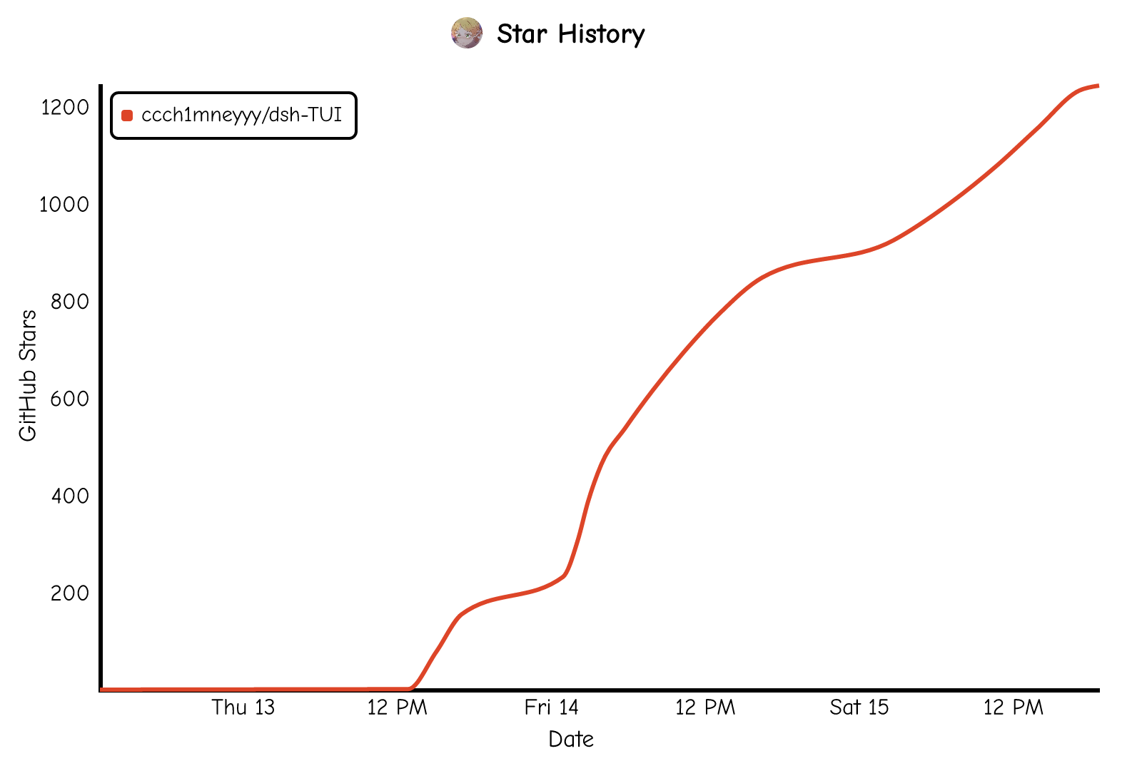
A beautiful, practical Claude Code-style TUI plugin with pixel whale top bar, flowing glow title, real-time status line, streaming thought expansion, time rewind, context progress bar and TPS gauge — zero core changes.
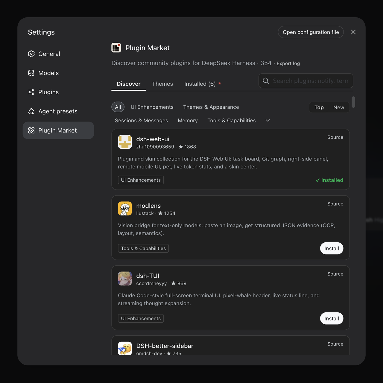
The plugin market for DeepSeek Harness: browse/search/one-click install community plugins and themes, with updates, backup/restore, hot disable, diagnostics, and AI fix.

A persistent whale widget on the DSH web UI that shows DeepSeek balance, today's usage, and per-turn cost, with drag-and-snap and sound effects.